本文使用的R版本为4.1.1,echarts4r包的版本为0.4.1,对应Echarts版本为5.0
照旧,编造数据作图用:
library(echarts4r)
library(data.table)

data.1 <- data.frame(
  x = seq(50),
  y = sample(1:100, 50, replace = TRUE),
  z = sample(1:20, 50, replace = TRUE),
  type = sample(c('A', 'B', 'C'), 50, replace = TRUE))
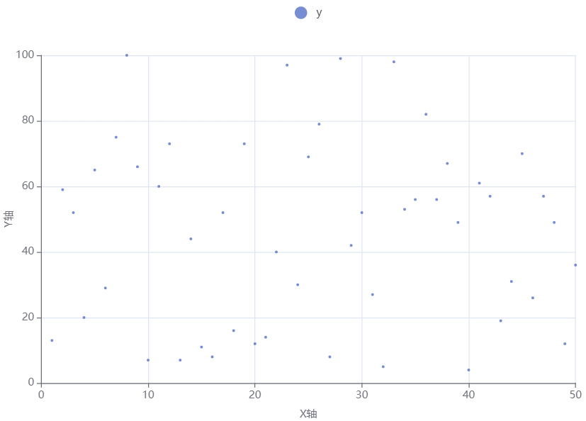
1.基本散点图 🔗
echarts4r包中散点图的函数是e_scatter:
data.1 |>
  e_charts(x) |> #横轴
  e_scatter(y) |> #纵轴
  e_x_axis(name = "X轴",
           nameLocation = "center",
           nameGap = 30) |>
  e_y_axis(name = "Y轴",
           nameLocation = "center",
           nameGap = 30) |>
  e_tooltip(trigger = "axis")
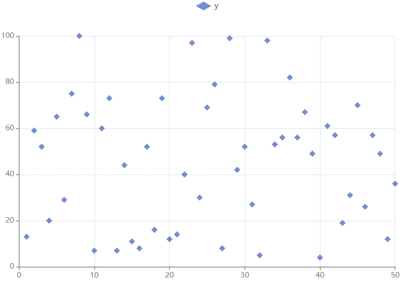
改变点的形状,形状的选项有circle, rect, roundRect, triangle, diamond, pin, arrow, none。
data.1 |>
  e_charts(x) |> #横轴
  e_scatter(y, symbol_size = 10, symbol = "diamond")
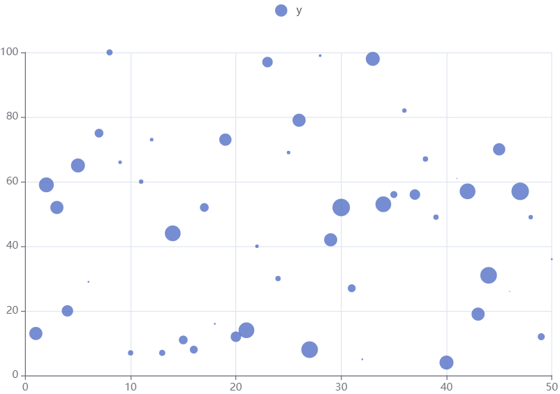
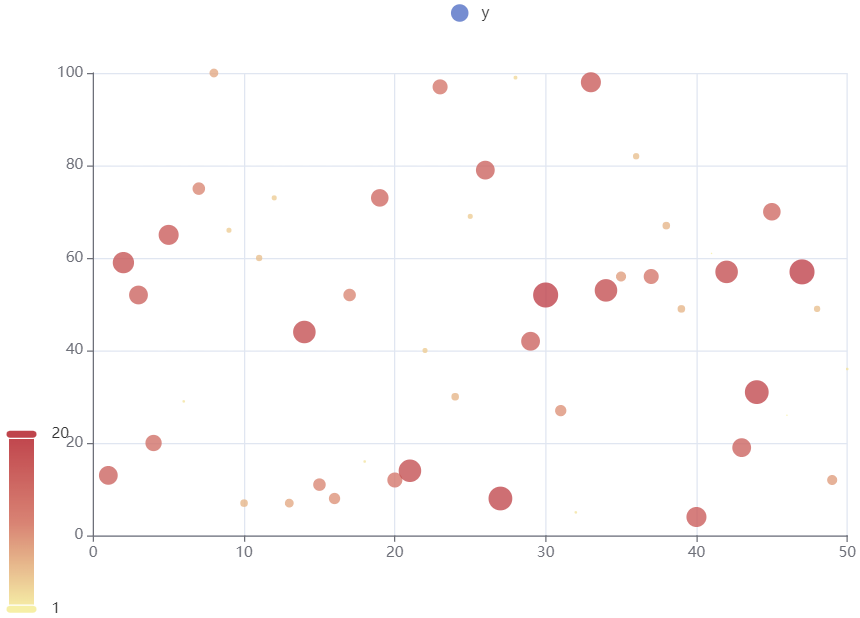
给散点图增加新维度,点的大小:
data.1 |>
  e_charts(x) |>
  e_scatter(y, z) |> #z的数值代表点(气泡)的大小
  e_tooltip(trigger = "axis")
给散点图增加新维度,点的颜色深浅:
data.1 |>
  e_charts(x) |>
  e_scatter(y, z) |>
  e_visual_map(z) |> #z的数值代表点(气泡)的颜色深浅
  e_tooltip(trigger = "axis")
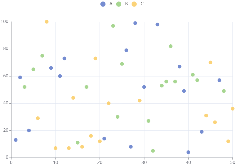
2.多组数据 🔗
需要同时展示多组数据时,若使用group_by函数,图例中不同类别的散点会自动用不同颜色区分:
data.1 |>
  group_by(type) |> #分组类别
  e_charts(x) |>
  e_scatter(y, symbol_size = 10)
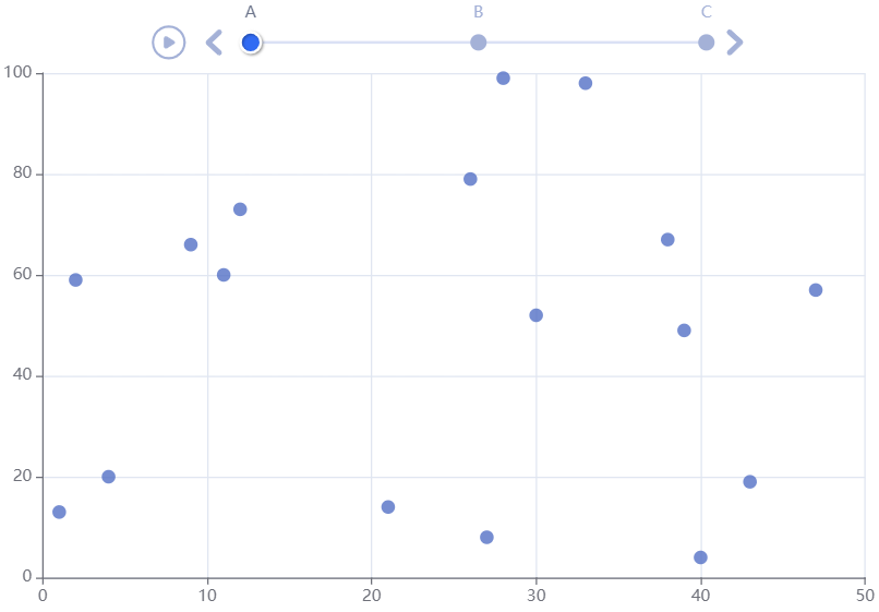
也可以用时间轴:
data.1 |>
  group_by(type) |>
  e_charts(x, timeline = TRUE) |>
  e_scatter(y, symbol_size = 10) |>
  e_legend(show = FALSE) |>
  e_timeline_opts(top = 5)
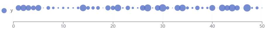
3.单轴(singleAxis)散点图 🔗
基本的单轴散点图如下:
data.1 |>
  e_charts(x, height=100) |> #横轴
  e_single_axis(bottom = 20) |> #single组件离容器下册的距离
  e_scatter(y, #值
            z, #点的大小
            coord_system = "singleAxis") |>
  e_legend(left = "left", bottom = "center")
4.散点图实用案例 🔗
此部分选了几个Apache Echarts官网的例子,笔者尝试着用echarts4r包尽量还原。有些Echarts官网引用的JSON数据,笔者下载下来转成csv格式后放在这里。
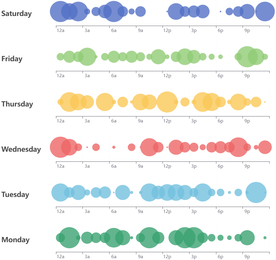
4.1.多图组合的单轴散点图 🔗
下图与原图相比,看上去几乎完全还原,但有两点细节不一致:
-
没有使用原图的数据,而是重新随机生成。
-
没有设置提示框(tooltip)。
data.2<-data.frame(
  hours=c('12a', '1a', '2a', '3a', '4a', '5a',
          '6a', '7a', '8a', '9a', '10a', '11a',
          '12p', '1p', '2p', '3p', '4p', '5p',
          '6p', '7p', '8p', '9p', '10p', '11p'),
  Saturday_value = c(1:24),
  Saturday_size = sample(0:14, 24, replace = TRUE),
  Friday_value = c(1:24),
  Friday_size = sample(0:14, 24, replace = TRUE),
  Thursday_value = c(1:24),
  Thursday_size = sample(0:14, 24, replace = TRUE),
  Wednesday_value = c(1:24),
  Wednesday_size = sample(0:14, 24, replace = TRUE),
  Tuesday_value = c(1:24),
  Tuesday_size = sample(0:14, 24, replace = TRUE),
  Monday_value = c(1:24),
  Monday_size = sample(0:14, 24, replace = TRUE),
  Sunday_value = c(1:24),
  Sunday_size = sample(0:14, 24, replace = TRUE))

e1 <- data.2 |>
  #`height = 100`用来设置图形高度
  e_charts(hours, height = 100) |> #横轴
  #`bottom = 20`用来设置single组件距离容器下侧的距离
  #`left=150`用来设置single组件距离容器左侧的距离
  #`axisLabel=list(interval=2)`用来限定single组件单轴的显示间隔
  e_single_axis(bottom = 20, left=150, axisLabel=list(interval=2)) |>
  e_scatter(Saturday_value, #纵轴
            Saturday_size, #气泡大小
            #写入JavaScript语言的缩放函数
            scale_js = 'function (dataItem) {return dataItem[2] * 4;}',
            color = "#5470c6", #气泡颜色
            coord_system = "singleAxis") |>
  e_legend(show = FALSE) |>
  e_title("Saturday", left = "left", top='middle')

e2 <- data.2 |>
  e_charts(hours, height = 100) |>
  e_single_axis(bottom = 20, left=150, axisLabel=list(interval=2)) |>
  e_scatter(Friday_value,
            Friday_size,
            scale_js = 'function (dataItem) {return dataItem[2] * 4;}',
            color = "#91cc75",
            coord_system = "singleAxis") |>
  e_legend(show = FALSE) |>
  e_title("Friday", left = "left", top='middle')

e3 <- data.2 |>
  e_charts(hours, height = 100) |>
  e_single_axis(bottom = 20, left=150, axisLabel=list(interval=2)) |>
  e_scatter(Thursday_value,
            Thursday_size,
            color = "#fac858",
            scale_js = 'function (dataItem) {return dataItem[2] * 4;}',
            coord_system = "singleAxis") |>
  e_legend(show = FALSE) |>
  e_title("Thursday", left = "left", top='middle')

e4 <- data.2 |>
  e_charts(hours, height = 100) |>
  e_single_axis(bottom = 20, left=150, axisLabel=list(interval=2)) |>
  e_scatter(Wednesday_value,
            Wednesday_size,
            color = "#ee6666",
            scale_js = 'function (dataItem) {return dataItem[2] * 4;}',
            coord_system = "singleAxis") |>
  e_legend(show = FALSE) |>
  e_title("Wednesday", left = "left", top='middle')

e5 <- data.2 |>
  e_charts(hours, height = 100) |>
  e_single_axis(bottom = 20, left=150, axisLabel=list(interval=2)) |>
  e_scatter(Tuesday_value,
            Tuesday_size,
            color = "#73c0de",
            scale_js = 'function (dataItem) {return dataItem[2] * 4;}',
            coord_system = "singleAxis") |>
  e_legend(show = FALSE) |>
  e_title("Tuesday", left = "left", top='middle')

e6 <- data.2 |>
  e_charts(hours, height = 100) |>
  e_single_axis(bottom = 20, left=150, axisLabel=list(interval=2)) |>
  e_scatter(Monday_value,
            Monday_size,
            color = "#3ba272",
            scale_js = 'function (dataItem) {return dataItem[2] * 4;}',
            coord_system = "singleAxis") |>
  e_legend(show = FALSE) |>
  e_title("Monday", left = "left", top='middle')

e7 <- data.2 |>
  e_charts(hours, height = 100) |>
  e_single_axis(bottom = 20, left=150, axisLabel=list(interval=2)) |>
  e_scatter(Sunday_value,
            Sunday_size,
            color = "#fc8452",
            scale_js = 'function (dataItem) {return dataItem[2] * 4;}',
            coord_system = "singleAxis") |>
  e_legend(show = FALSE) |>
  e_title("Sunday", left = "left", top='middle')

e_arrange(e1, e2, e3, e4, e5, e6, e7, cols = 1)
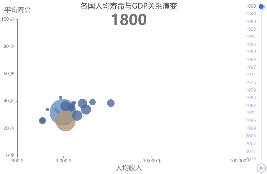
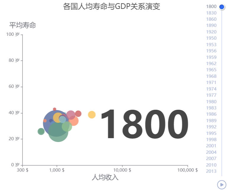
4.2.各国人均寿命与GDP演变关系 🔗
下图与原图相比有三处未能完全还原:
- 散点的颜色
即使照搬原图中visualMap的参数设定,图形中气泡的颜色也与原图不一样。
- 标题的位置
原图中主标题是随时间轴变动的年份,副标题是文字,主标题和副标题在图形中的位置可以分开单独设定。但是echarts4r里面似乎主标题和副标题的位置是捆绑在一起的,并且随时间轴变动的标题内容需要在e_timeline_serie里设定,还得把每个展示出来的时间轴标签对应的标题都写一遍……
- 时间轴的范围
原数据中一共有81个年份,原图的时间轴最多能显示出来41个,但是echarts4r中最多只能显示出来21个。
#数据下载地址:https://cdn.jsdelivr.net/gh/apache/echarts-website@asf-site/examples/data/asset/data/life-expectancy.json

life <- fread('./data/life-expectancy.csv')

life.2 <- life[Year %in% c(
  1800,1840,1880,1920,1951,1955,1959,1963,1967,1971,
  1975,1979,1983,1987,1991,1995,1999,2003,2007,2011,2015), ]

life.2 |>
  group_by(Year) |>
  e_charts(Income, timeline = TRUE) |>
  e_scatter(
    serie = Life_Expectancy,
    size = Population ,
    bind = Country,
    itemStyle = list(opacity = 0.8),
    scale_js = "function(data){ return 80*(Math.sqrt(data[2]/ 5e8) + 0.1);}") |>
  e_tooltip(
    padding = 5,
    borderWidth = 1,
    trigger = "item",
    formatter = htmlwidgets::JS(
      "function(params){
        return('<strong>国家:' +  params.name +
               '</strong><br />人均收入: ' + params.value[0] +'美元'+
               '<br />人均寿命: ' + params.value[1] +'岁'+
               '<br />总人口: ' + params.value[2])}")) |>
  e_legend(show = FALSE) |>
  e_x_axis(
    type = 'log',
    name = '人均收入',
    max = 100000,
    min = 300,
    nameGap = 25,
    nameLocation = 'middle',
    nameTextStyle = list(fontSize = 18),
    splitLine = list(show = FALSE),
    axisLabel = list(formatter = '{value} $')) |>
  e_y_axis(
    type = 'value',
    name = '平均寿命',
    max = 100,
    nameTextStyle = list(fontSize = 18),
    splitLine = list(show = FALSE),
    axisLabel = list(formatter = '{value} 岁')) |>
  e_title(left = 'center', top = 10) |>
  e_timeline_opts(
    axisType = 'category',
    orient = 'vertical',
    inverse = TRUE,
    left = NULL,
    right = 0,
    top = 20,
    bottom = 20,
    width = 55,
    height = NULL,
    symbol = 'none',
    checkpointStyle = list(borderWidth = 2),
    controlStyle = list(showNextBtn = FALSE,
                        showPrevBtn = FALSE)) |>
  e_timeline_serie(
    title = list(
      list(
        text = '各国人均寿命与GDP关系演变',
        textStyle = list(fontWeight = 'normal',
                           fontSize = 20),
        subtext = '1800',
        subtextStyle = list(fontWeight = 'bold',
                            fontSize = 40)),
      list(text = '各国人均寿命与GDP关系演变', subtext = '1840'),
      list(text = '各国人均寿命与GDP关系演变', subtext = '1880'),
      list(text = '各国人均寿命与GDP关系演变', subtext = '1920'),
      list(text = '各国人均寿命与GDP关系演变', subtext = '1951'),
      list(text = '各国人均寿命与GDP关系演变', subtext = '1955'),
      list(text = '各国人均寿命与GDP关系演变', subtext = '1959'),
      list(text = '各国人均寿命与GDP关系演变', subtext = '1963'),
      list(text = '各国人均寿命与GDP关系演变', subtext = '1967'),
      list(text = '各国人均寿命与GDP关系演变', subtext = '1971'),
      list(text = '各国人均寿命与GDP关系演变', subtext = '1975'),
      list(text = '各国人均寿命与GDP关系演变', subtext = '1979'),
      list(text = '各国人均寿命与GDP关系演变', subtext = '1983'),
      list(text = '各国人均寿命与GDP关系演变', subtext = '1987'),
      list(text = '各国人均寿命与GDP关系演变', subtext = '1991'),
      list(text = '各国人均寿命与GDP关系演变', subtext = '1995'),
      list(text = '各国人均寿命与GDP关系演变', subtext = '1999'),
      list(text = '各国人均寿命与GDP关系演变', subtext = '2003'),
      list(text = '各国人均寿命与GDP关系演变', subtext = '2007'),
      list(text = '各国人均寿命与GDP关系演变', subtext = '2011'),
      list(text = '各国人均寿命与GDP关系演变', subtext = '2015'))) |>
 # e_grid(top = 100, left = 30, right = 110) |>
  e_visual_map(
    serie = Population,
    type='piecewise',
    show = FALSE,
    dimension = 2,
    inRange = list(
      color = c(
        '#51689b','#ce5c5c','#fbc357','#8fbf8f','#659d84',
        '#fb8e6a','#c77288','#786090','#91c4c5','#6890ba' )))
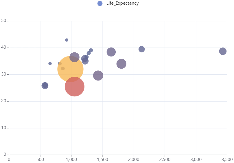
照搬的颜色设定如下:
life.2[Year==1800,] |>
  e_charts(Income) |>
  e_scatter(
    serie = Life_Expectancy,
    size = Population ,
    bind = Country,
    itemStyle = list(opacoty = 0.8),
    scale_js = "function(data){ return 80*(Math.sqrt(data[2]/ 5e8) + 0.1);}") |>
  e_visual_map(
    show = FALSE,
    dimension = 3,
    categories = c(
      'Australia','Canada','China','Cuba','Finland','France',
      'Germany','Iceland','India','Japan','North Korea','South Korea',
      'New Zealand','Norway','Poland','Russia','Turkey','United Kingdom',
      'United States'),
    inRange = list(
      color = htmlwidgets::JS(
        "(function () {
              // prettier-ignore
              var colors = ['#51689b', '#ce5c5c', '#fbc357', '#8fbf8f', '#659d84',
              '#fb8e6a', '#c77288', '#786090', '#91c4c5', '#6890ba'];
              return colors.concat(colors);
            })()"
      )
    )
  )
下面左图是Echarts官网的原图,
|
|
|---|
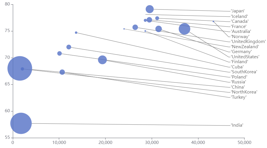
4.3.散点图标签顶部对齐 🔗
life2<-fread('./data/life_expectancy2.csv')

life2[Year==1990,]|>
  e_charts(Income)|>
  e_scatter(
    serie = Life_Expectancy,
    size = Population,
    bind = Country,
    scale_js = 'function (data) { return Math.sqrt(data[2]) / 5e2;}',
    emphasis = list(focus = "self"),
    labelLayout = list(x = "85%",
                       moveOverlap = "shiftY"),
    labelLine = list(
      show = TRUE,
      length2 = 5,
      lineStyle = list(color = "gray"))) |>
  e_legend(show = FALSE) |>
  e_x_axis(splitLine = list(show = FALSE)) |>
  e_y_axis(splitLine = list(show = FALSE), min = 55) |>
  e_grid(left = 40, right ='10%') |>
  e_labels(
    show = TRUE,
    position = 'right',
    formatter = htmlwidgets::JS("function(params){
         return( params.name)}"))
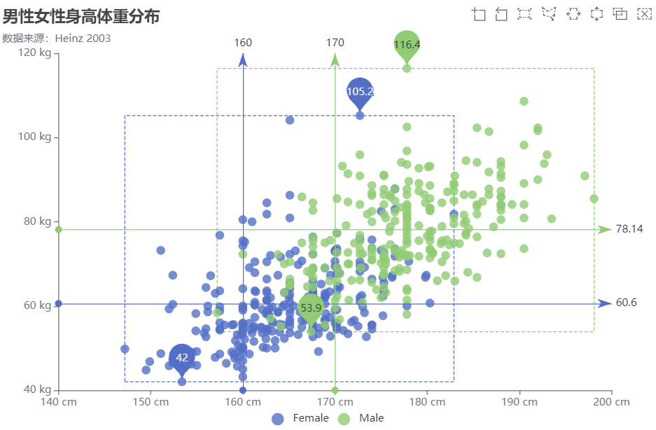
4.4.男性女性身高体重分布 🔗
完全还原了原图。
hw <- fread('./data/height-weight.csv')

hw|>
  group_by(type)|>
  e_charts(height )|>
  e_scatter(serie = weight,symbol_size = 10)|>
  e_title('男性女性身高体重分布','数据来源:Heinz 2003',left='left',top=5)|>
  e_grid(left='3%',
         right='7%',
         bottom='7%',
         containLabel=TRUE)|>
  e_tooltip(
    trigger = 'item',
    showDelay = 0,
    axisPointer = list(
      show = TRUE,
      type = 'cross',
      lineStyle = list(type = 'dashed',
                       width = 1),
      formatter=htmlwidgets::JS(
        "function (params) {
      if (params.value.length > 1) {
        return (
          params.seriesName +
          ' :<br/>' +
          params.value[0] +
          'cm ' +
          params.value[1] +
          'kg '
        );
      } else {
        return (
          params.seriesName +
          ' :<br/>' +
          params.name +
          ' : ' +
          params.value +
          'kg '
        );
      }
    }")))|>
  e_toolbox_feature(feature = c('dataZoom', 'brush')) |>
  e_legend(left = 'center', bottom = 10) |>
  e_x_axis(
    type = 'value',
    min = 140,
    max = 200,
    axisLabel = list(formatter = '{value} cm'),
    splitLine = list(show = FALSE))|>
  e_y_axis(
    type='value',
    min = 40,
    max = 120,
    axisLabel = list(formatter = '{value} kg'),
    splitLine = list(show = FALSE))|>
  e_mark_area(
    silent = TRUE,
    itemStyle = list(
      color = 'transparent',
      borderWidth = 1,
      borderType = 'dashed'),
    #serie = "Female",
    data = list(
      list(xAxis = "min", yAxis = "min"),
      list(xAxis = "max", yAxis = "max"))) |>
  e_mark_point(data = list(type = 'min')) |>
  e_mark_point(data = list(type = 'max')) |>
  e_mark_line(data = list(type = 'average'),
              lineStyle = list(type = 'solid')) |>
  e_mark_line(serie = 'Female',
              data = list(xAxis = 160)) |>
  e_mark_line(serie = 'Male',
              data = list(xAxis = 170))